What Makes an Email Signature Good or Bad?
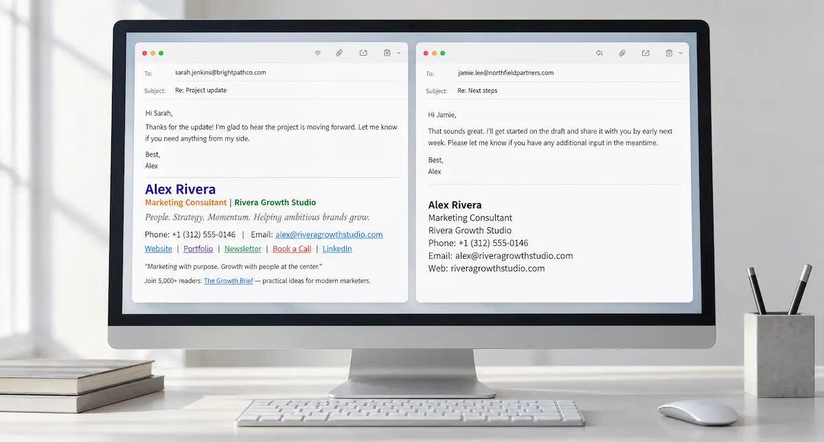
An email signature can look polished and still be frustrating to use. The phone number is too small to read, the contact details are buried under promotional messages, or the entire block is an image with no separate links.
A good email signature makes the sender easy to identify and the relevant contact details easy to use. A bad email signature gets in the way, whether through missing information, unnecessary content, or formatting that falls apart in a received message.
The examples below show common problems and how to fix them without turning a signature into a design project. For a simple HTML version with clickable contact details, create your email signature in the generator.
What makes a good email signature?
Think about what happens when someone needs a detail from an email. They scroll to the bottom to find a phone number, check the sender’s role, or open the company website. The signature should make that straightforward.
Clarity starts with the information itself. A recognizable name and a specific role tell the recipient who they are speaking to. Contact details should lead to someone who can handle their response. One relevant web link gives them a useful destination without asking them to choose between several competing options.
A good email signature format puts those details in a predictable order and gives them enough space to read comfortably. The name can be bold, but every line does not need a different font, color, or treatment.
Good and bad email signature examples
These examples use fictional people and businesses. Each pair keeps the sender the same so the changes are easy to follow.
1. The sender’s role is unclear
Before
Alex R.
Your partner in growth
Phone: +1 (312) 555-0146
Let’s build something great!
There is a phone number, but little context. Someone receiving a forwarded message cannot tell Alex’s full name, company, or role. The slogan does not answer those questions.
After
Alex Rivera
Marketing Consultant
Rivera Growth Studio
Phone: +1 (312) 555-0146
Email: alex@riveragrowthstudio.com
Web: riveragrowthstudio.com
The revised version replaces vague promotional wording with information the recipient can use. It is clear who Alex is and which business the message comes from.
2. Too many links compete for attention
Before
Maya Chen
Brand Designer | Studio Forma
Email: maya@studioforma.design
Website: studioforma.design | Portfolio: studioforma.design/work
Instagram: instagram.com/studioforma | Newsletter: studioforma.design/newsletter
Book a call: studioforma.design/book | Latest offer: studioforma.design/offers
Nothing here is necessarily wrong on its own. Together, the links turn the end of the message into a menu. A prospective client looking for Maya’s work has to find the portfolio among several other destinations.
After
Maya Chen
Brand Designer
Studio Forma
Phone: +1 (415) 555-0183
Email: maya@studioforma.design
Web: studioforma.design/work
For Maya’s usual client correspondence, the portfolio is the most useful link. It can provide access to the studio’s wider website without putting every page in the signature.
3. The details are readable but cannot be used directly
Imagine the following signature exported as a single PNG:
Ethan Brooks
Operations Manager
Cedar Lane Services
Phone: +1 (206) 555-0172
Email: ethan@cedarlaneservices.com
Web: cedarlaneservices.com
Visually, the information is clear. The problem is the format. The phone number and email address are part of a picture, so the recipient cannot select them as text. Linking the whole image to the website gives it one destination, rather than separate links for each contact.
The corrected version can look almost identical. Keep the details as HTML text, with a phone link on the number, an email link on the address, and a website link on the final line.
This is an important distinction when looking at examples of good email signatures: a screenshot shows the appearance, but it does not show whether the signature is usable.
A signature can look good and still be difficult to use
A good email signature design needs to hold up at the bottom of an actual message. A layout that looks balanced on a large monitor can become awkward on a phone, especially when several columns force the text into a narrow space.
Small text is another common problem. Reducing the font size to fit more content creates a compact signature at the cost of readability. Simplifying the content is usually a better choice.
Check the links too. An old booking address or a phone number for the wrong branch is more consequential than a minor spacing issue. A clean signature with outdated details still fails the person trying to contact the sender.
Choose details that fit the conversation
Good business email signatures do not all need the same final link. A consultant who regularly discusses meetings can use a booking page. A designer speaking with prospective clients can link to a portfolio. Someone answering a broader range of questions can use the company website.
The same applies to phone numbers and inboxes. A direct number makes sense when the recipient needs that employee. A shared address is useful when a team handles scheduling or support and needs to receive the reply.
For a small team, keep the format consistent while letting the details reflect each person’s work. Matching signatures should not send every enquiry to the same place by default.
What to leave out
Quotes, slogans, promotional banners, and rows of social icons add content that the recipient has to scan past. Unless a detail serves a clear purpose in the correspondence, it does not need a place in the signature.
For a minimal professional signature, photos and logos are unnecessary too. A clear name, role, company, and useful contact information can identify the sender without additional graphics.
A bad email signature is not always overloaded, though. Removing so much that only a first name remains can leave a new contact without enough context. The aim is to retain useful information, not simply achieve the shortest possible block.
Check the signature in a real email
Send a test message and read the received email on desktop and mobile. Check whether the sender’s name and role are clear, whether long addresses wrap awkwardly, and whether every contact link works.
Then reply to the message. A signature that seems modest on its own can take up considerable space when repeated throughout a thread. Where the email client supports it, a shorter signature for replies can keep ongoing conversations easier to follow.
Create a good email signature without designing it from scratch
Once the details are settled, the remaining task is formatting them as a usable signature.
EmailSignatures.xyz creates compact HTML signatures with selectable text and clickable contact links. The final web link can lead to a company website, portfolio, or booking page, depending on the sender’s work.
Create your email signature and download the HTML file for installation in the email client.