What a Minimalist Email Signature Actually Looks Like
Most email signatures make one of two mistakes.
The first: too little. Just a name, maybe a phone number. Nothing that tells the recipient who they’re actually talking to or how to reach you through any other channel.
The second: too much. A logo, a headshot, four social media icons, a promotional banner, a motivational quote, a legal disclaimer, and a CTA button linking to a scheduling tool. By the time someone reads to the bottom of your email, they’ve already forgotten what the message was about.
A minimalist email signature sits between those two failure modes. Not stripped down to the point of being unhelpful. Not loaded up with elements that serve the sender’s marketing agenda more than the recipient’s actual needs.
Six fields. Clean HTML. Works everywhere. Doesn’t require a platform to create or maintain.
If you want to skip straight to building one, you can create your email signature in minutes—$20, one payment, no subscription.
What Makes an Email Signature Minimalist
Minimalism in an email signature isn’t really about design. It’s about intent.
A minimal email signature includes everything the recipient might need to follow up with you and nothing that’s there to serve any other purpose. No promotional content. No visual noise. No elements that look impressive in a screenshot but render as broken images in half the email clients they land in.
The practical result looks like this:
- Only essential contact information
- No elements that require the recipient to do anything (click a banner, watch a video, follow a social account)
- Renders correctly on desktop, mobile, and every major email client without custom CSS
- Loads instantly because there’s nothing to load beyond text and one optional link
The difference between minimalist and empty is important. A name and nothing else isn’t minimalist—it’s incomplete. A clean email signature gives recipients exactly what they need to reach you. That’s a specific set of information, not as little as possible.
What to Include and What to Leave Out
The six fields that belong in a simple email signature:
Full Name: how you appear professionally, not a nickname
Job Title: what you actually do, specific enough to be meaningful
Company: where you work, or “Freelance” if you’re independent
Phone Number: the number you actually answer
Email Address: yes, even though it’s already in the header. Recipients forward emails, print them, screenshot them. Having your email in the signature means it’s always accessible regardless of context.
One link: your website, portfolio, or LinkedIn. One. Not three.
What doesn’t belong:
Promotional banners. These exist to serve your marketing, not the recipient. They break in email clients, they look like ads, and they undermine the professional tone of the message above them.
Multiple social media icons. Most recipients won’t click through five different social profiles. One relevant profile is usually enough.
Motivational quotes. These feel personal to the sender and awkward to the recipient, especially in professional contexts.
Animated elements. GIFs and animations in email signatures are almost universally a mistake. They rarely render correctly, they distract, and they make the sender look like they’re trying too hard.
Multiple CTAs. One link is a reference. Two links is a choice the recipient didn’t ask to make. Three links is noise.
Minimalist Email Signature Examples
Two formats work well depending on how much information you need to convey.
Standard Format (6 lines)
This is the right structure for most professionals. Each piece of information gets its own line, nothing competes for attention, and the whole thing reads clearly at a glance.
Example 1: Freelancer
Sarah Mitchell
Copywriter
Freelance
(512) 555-0123
sarah@sarahmitchell.com
sarahmitchell.com
All six fields present. “Freelance” in the company line makes the working arrangement immediately clear without requiring any explanation.
Example 2: Corporate Professional
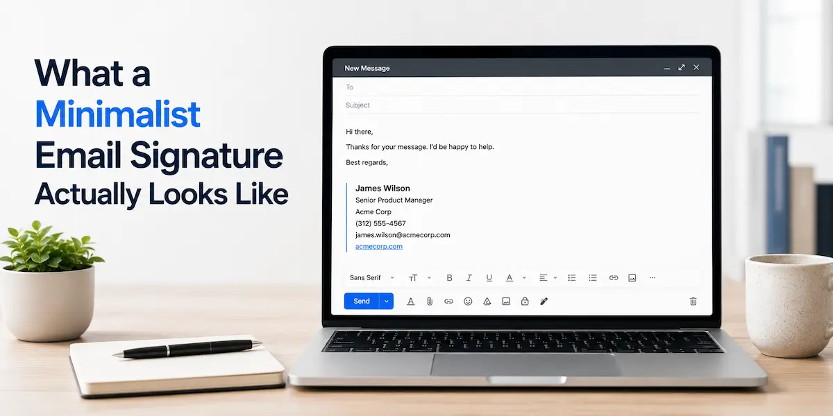
James Wilson
Senior Product Manager
Acme Corp
(312) 555-4567
james.wilson@acmecorp.com
acmecorp.com
Standard six fields, nothing added, nothing removed. The company website on the last line gives recipients a reference point without requiring James to explain what Acme Corp does.
Example 3: Consultant
Elena Rodriguez
Independent Strategy Consultant
Rodriguez Consulting
(617) 555-8823
elena@rodriguezco.com
rodriguezco.com
Company name matches the domain. Six clean fields, each one doing a specific job.
Example 4: Small Business Owner
David Kim
Owner
Kim Design Studio
(206) 555-9012
david@kimdesign.co
kimdesign.co
Title kept short. Company name on its own line. Six fields, no shortcuts, no extras.
Compact Format (4 lines)
When you want maximum brevity without losing the essentials, name, title, and company compress into a single line with a pipe separator. The remaining three lines handle contact details.
Example 5: Compact Professional
Mia Park | Marketing Director at Northfield Group
(415) 555-2341
mia.park@northfieldgroup.com
northfieldgroup.com
All the same information as the six-line format — name, title, company, phone, email, website — compressed into four lines. Works especially well when the job title is short enough not to wrap on mobile.
Example 6: Compact Freelancer
Tom Reeves | UX Designer at Reeves Creative Studio
(503) 555-6789
tom@tomreeves.io
tomreeves.io
Same structure: name, title, and company on line one, then phone, email, and website on lines two through four. The studio name makes the freelance context clear without needing a separate company line.
The format you choose depends on how much information you need to convey and how compact you want the result to be. Both are minimalist email signature templates. Neither requires design software, a subscription, or a dedicated platform.
Why Most Signature Platforms Work Against Minimalism
This is worth understanding before you choose how to create your signature.
Email signature platforms are businesses. Their revenue model depends on you staying subscribed, which means their product incentives push in a specific direction: more features, more customization options, more elements to add. Every upsell is a new thing to put in your signature.
The result is that the default experience on most signature platforms pulls you away from minimalism, not toward it. You open the editor and there’s a field for a promotional banner. There’s a social media section. There’s a CTA button template. There’s an app store of signature add-ons. The path of least resistance is to add things.
A simple email signature generator should do the opposite: make it easy to enter the six fields that matter and produce clean HTML that works in Gmail and Outlook. Most platforms don’t prioritize that because it doesn’t serve their engagement model.
There’s also the subscription itself. Monthly or annual, the assumption is that you’ll keep paying indefinitely for access to a signature you created once. The signature doesn’t change. The billing does.
The Case for a One-Time Signature
A minimalist email signature doesn’t need a platform behind it.
You create it once. You paste the HTML into Gmail or Outlook. It works. Nothing needs updating unless your contact information changes, and when it does, you make the change once and you’re done.
No monthly fee. No annual renewal. No account to log into. No platform deciding what features you get access to based on which plan you’re on.
For most freelancers, consultants, and professionals who just need a clean signature that represents them well, this is the entire workflow:
- Enter your six fields
- Get clean HTML
- Paste into your email client
- Done
The lightweight email signature approach—minimal fields, no platform overhead, one-time setup—is also the most reliable one. There are no hosted images that break when a provider changes their CDN. No dynamic content that fails to load. No third-party platform that can go down or change its pricing model.
You can create your email signature for $20—one payment, no subscription, works permanently across Gmail, Outlook, and every major email client.
Final Thoughts
A clean email signature is one of those things that’s easy to get wrong in both directions.
Too little and you’re making recipients work to figure out who you are. Too much and you’re making them wade through your marketing to find your phone number.
The minimalist version isn’t a compromise between those two. It’s a deliberate choice to give recipients exactly what they need—no more, no less—and to keep the focus where it belongs: on the message you actually sent.